Asset management UX and content strategy
Janus Capital: Advisor Experience Redesign
Designing the financial advisor experience
Janus Capital realized it was time to improve how financial advisors used their digital platform. Advisors play a key role in the firm’s retail business. They turned to Janus for clear, reliable information to help with client decisions. Instead, they found fund details, research, and commentary spread out in too many places. This made it difficult to find what they needed and move forward with confidence.
The main goal was to give advisors the right information at the right time, in a way that matched how they work. I saw an opportunity to add structure and clarity to the experience, helping advisors move easily from discovery to evaluation to client conversations. As VP of Experience Design at Enlighten, I met with advisors and Janus leaders to learn what mattered most. Advisors wanted a story that connected product details like fees, performance, holdings, and risk with real-time manager insight and practical resources. Their feedback guided every design decision we made.
From the advisor’s question
to a useful next step.
with client needs
to the investment facts
and supporting resources
A map of the design rationale and the experience it shaped.
02 / Experience direction
Fund Taxonomy & Navigation:
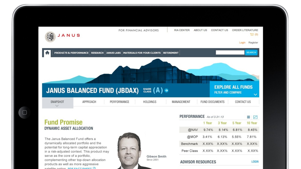
I rebuilt how funds were organized and navigated, creating a tool that let advisors screen, compare, and analyze funds quickly and with less friction.
Integrated Content Journeys:
I designed pages so that product data, manager commentary, and research worked together. Advisors could find the right insights and client-ready materials at every step.
Advisor-Centric Resources:
I grouped fact sheets, comparison tools, and key documents within easy reach, where advisors needed them most.
Focused Hierarchy:
Advisors told us what mattered. I made fund managers and independent ratings stand out, while dialing back less important data.
Tablet Optimization and Component Design:
I worked with development and QA to ensure the experience worked just as well on tablets. Advisors needed to share information with clients while on the go, so we focused on details like finger-friendly dropdowns, clear click indicators, readable charts, and links that responded to a tap.
Compliance Partnership:
I worked side by side with Janus’s legal and regulatory teams to make sure every part of the experience met compliance needs, without losing sight of what advisors needed to do.
03 / Start with the advisor
The next decision
shapes the experience.
We listened to people from sales, product, digital marketing, and technology at Janus. Advisors often came to Janus after doing their own research elsewhere. They wanted an inside view: how the fund worked, what the managers were thinking, and resources to help them talk with clients.
Janus’s digital platform needed to serve many audiences, but we focused on advisors first, with analysts as a close second. The homepage and fund pages had to make quick tasks easy and provide a clear path to more detailed information. Whether an advisor was preparing for a meeting or an analyst was researching fund data, the structure needed to work for both, just at different levels of detail.
I took a user-centered approach, mapping out advisor journeys and workflows to get clear on what they needed. Along the way, I ran regular design reviews to iron out details, solve edge cases, and keep everyone aligned, from product to compliance. We built quick prototypes, tested them with real advisors, and kept improving. Every step balanced business goals with what would actually work in practice.
The prototypes set a new standard for fund pages and gave advisors a tool they actually used to learn about Janus funds and prepare for client conversations. The new experience told a clear product story, set honest expectations, and put useful resources front and center. Advisors could have better, more informed conversations with their clients.
04 / Client response
The impact was recognized by Janus leadership during the engagement. As Tom Beck, President of Enlighten, reported after a key prototype milestone:
“The client continues to be really impressed …”
Tom Beck, President, Enlighten, reporting Janus client feedback
Janus valued our expertise, attitude, and teamwork. One of the biggest challenges was making sure the new experience met strict compliance rules without making things harder for advisors. Early tests showed that important features like fund comparisons and downloads could get lost behind required disclosures. I worked closely with compliance, legal, and product teams to adjust how content and tools were grouped, so compliance was clear but never blocked what advisors needed to do. This project helped make Enlighten Janus’s go-to digital agency. Enlighten’s ongoing work with Janus reflected a strong client relationship in a regulated category.
We assessed progress qualitatively through advisor input, compliance reviews, design work, and client feedback. After launch, Janus saw more advisors using key fund pages and more downloads of fact sheets. Sales leaders told us advisors could get to product information faster, and the new comparison tools became part of their prep. These results are strong signals that the new experience made a real difference.
05 / Make investment information useful
Give the fund
a coherent story.
We built navigation and page structures that kept each fund’s story and key facts together, with clear paths to performance, holdings, commentary, and supporting documents. Advisors could find funds by investment category or by what their clients needed, such as income, growth, or capital preservation. These patterns made it easier to scan, compare, and connect the details to what mattered for each client.
Give every action a place.
I viewed information hierarchy and interaction design as a single decision. In reviews, I asked the team to keep related actions like downloading a fact sheet, saving or comparing a fund, and tracking it all in one place. Advisor resources, tools, similar funds, and recently viewed funds needed a consistent home.
That same thinking shaped every page. I adjusted manager profiles, ratings, and data points so they supported the fund’s story and the advisor’s job. Every component had to earn its spot. A good page made the next step obvious and the information easy to take in.
Early review
Make the hierarchy work harder.
Group the actions advisors use to evaluate, save and compare funds.
- Bring related fund actions together.
- Give advisor resources a consistent home.
- Balance product identity, facts and commentary.
07 / A repeatable content system
Build a system for different fund stories.
Janus needed a framework that could flex for different fund stories. A new fund needs an introduction. A management change needs an explanation. An established fund might need to reinforce its approach during a tough stretch. Each situation changes what content matters most.
We built page structures that could shift the story, proof points, manager commentary, and sales support as needed. The basics stayed the same, but the focus could change. My goal was to make the content work as one story, with performance, risk, and manager insight all reinforcing what the fund is and why it matters. We connected product details, research, and thought leadership so advisors could move easily from market commentary to investment specifics. Content strategy became part of the interface: what advisors needed to know, what they could share, and how Janus teams could organize it for each fund.
Let the reader choose
the level of detail.
09 / Design and delivery
Connect design decisions to delivery.
The experience had to fit Janus’s platform and how their teams built things. We focused on reusable components, clear documentation, and making sure visual designs matched how things actually worked. Axure prototypes and design files gave teams something real to build from.
We designed for both desktop and tablet, especially for advisors meeting with clients. Tablet optimization had to work within the existing platform. By tying those constraints to the user experience, we kept it practical for the teams that would build and maintain it.
11 / Perspective
What the work demonstrates
The project delivered a framework that connected fund discovery, investment information, and advisor support. We had to understand how professionals evaluate products and how investment managers help them explain those products to clients.
For me, the value here is simple: make complex information useful when someone needs to act. Janus put that to the test by aligning structure, messaging, and interaction so advisors could move from exploration to action. The goal was to make funds easier to understand and give advisors the clarity and confidence to share that understanding with their clients.
I was VP of Experience Design at Enlighten. Our team, including Tom Beck, Laurel Erickson, Deb Heslip, Tracy Toepfer, and Andrew Hainen, worked closely with Janus partners in product, sales, digital marketing, and technology. My role combined experience direction, hands-on design review, and cross-team collaboration to shape the advisor experience.
JT Anderson
Explore more work
Strategy, design, and digital experiences