AAA Life ExpressTerm
Helping people feel that a big decision is possible.
Product strategy, experience design, and creative leadership
Life insurance is easy to put off. It asks us to think about our families, our finances, and a future that rarely feels certain. When LIMRA research showed that nearly a third of people aged 25 to 44 wanted to buy life insurance entirely online, AAA Life recognized an opportunity. With ExpressTerm, my goal was to make that decision feel possible by building trust from the first quote all the way through to the final payment.
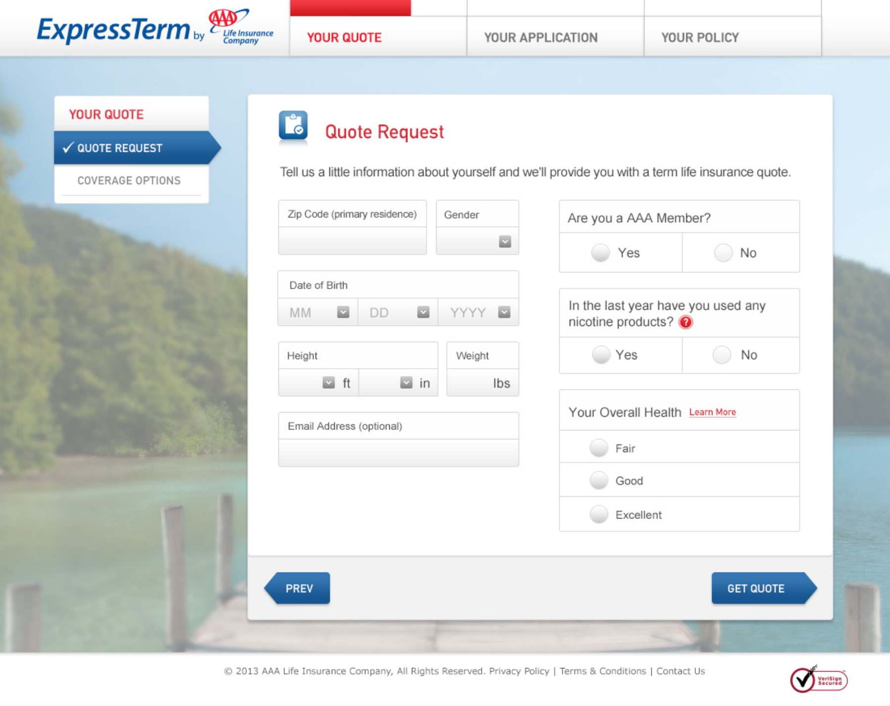
As VP and Executive Creative Director at Enlighten, I led the team in shaping both the positioning and the experience for ExpressTerm. My job was to turn strategy into something people could use. I worked directly on integration flows, annotated screens, and adaptive layouts for desktop, tablet, and mobile. Whenever the process became confusing or slowed someone down, I focused on making things clear. The product’s promise stayed visible at every step, from the first campaign statement to the smallest button label.
My role covered strategy, UX, design, content, and working directly with both engineering and AAA Life’s leadership. At every stage, I kept the customer’s experience at the center and focused on the product’s promise.
During usability testing, we listened carefully to what people said about our prototypes. The feedback was clear: people wanted a simple process, to see a quote before giving personal information, and the reassurance of the AAA brand. We learned what built confidence and where people got stuck. These insights led us to create a guided online experience that helps people make decisions with confidence.
Start with the decision people are trying to make
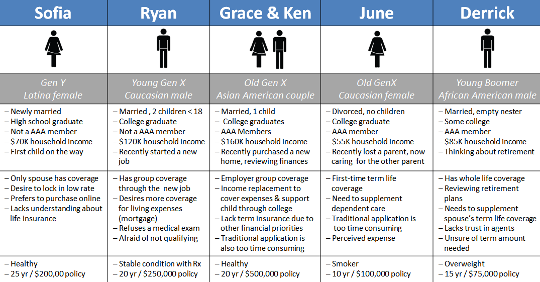
We focused on people who wanted convenience and were ready to buy online. Their reasons were personal, like starting a family, changing jobs, buying a home, or caring for someone who depends on them. Our research turned these real-life moments into clear customer profiles. This gave the team a practical way to understand needs, tradeoffs, and the decision itself.
Life events and coverage needs
We looked outside the insurance industry for inspiration. By studying how other fields guide people through complex and sensitive decisions, we learned what helps: showing progress, clarifying commitments, and giving explanations at the right time.
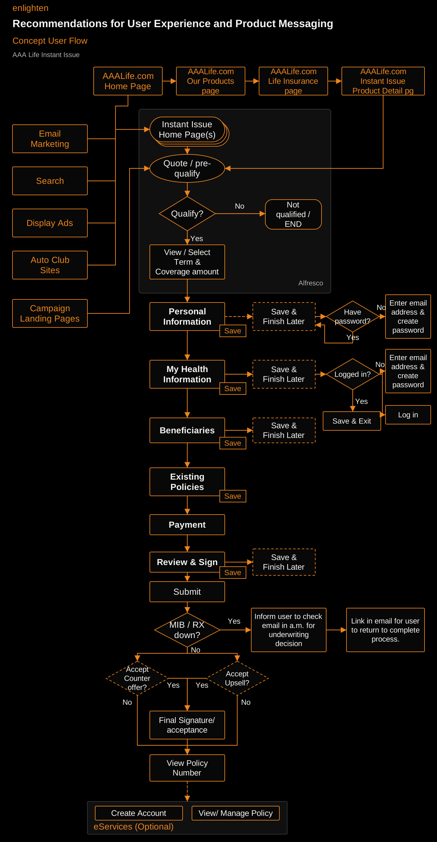
The process connected campaigns and AAA Life’s website to quoting, qualification, the application, and the final policy decision. Saving progress, returning later, email follow-ups, counteroffers, and optional account services all needed a clear place in the journey. Mapping these steps showed us where customers needed help and where the experience depended on another system.
The full application journey
Make confidence part of the flow.
Prototype testing showed us what built trust and where people still needed reassurance. The biggest wins were letting people see a quote before sharing personal details, keeping the process simple, using plain language, showing the familiar AAA brand, and using clear family imagery. Together, these elements made the prototype feel reassuring and highlighted what mattered most.
Making the options understandable
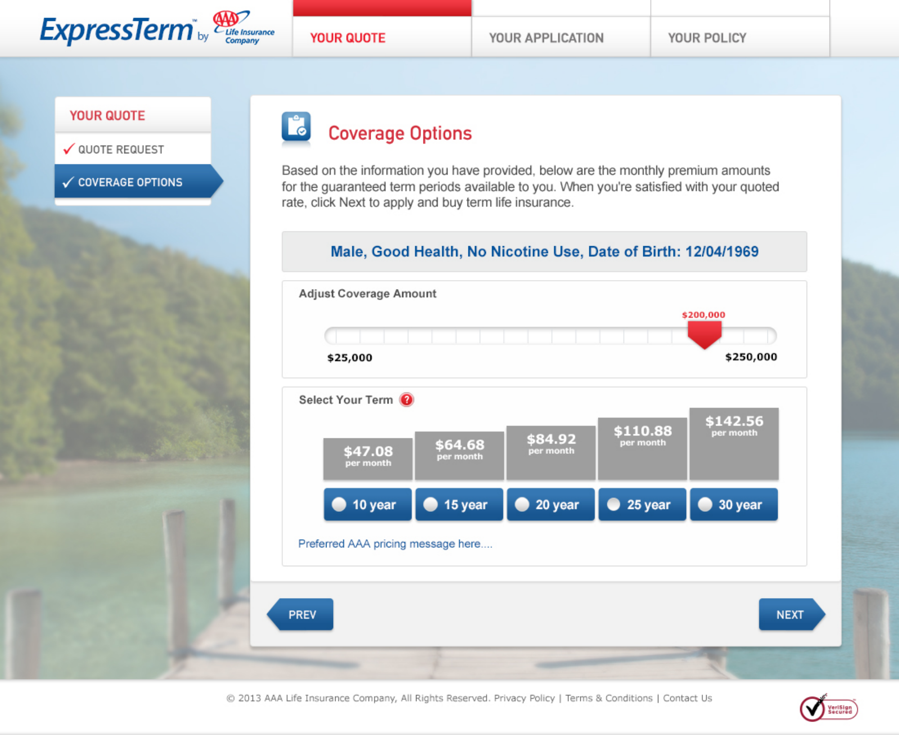
Setting expectations for the next step
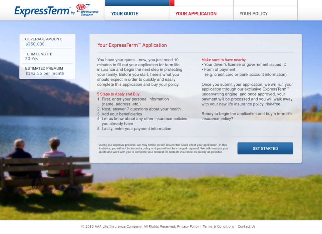
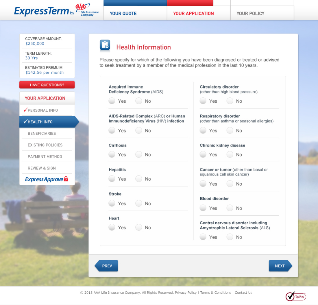
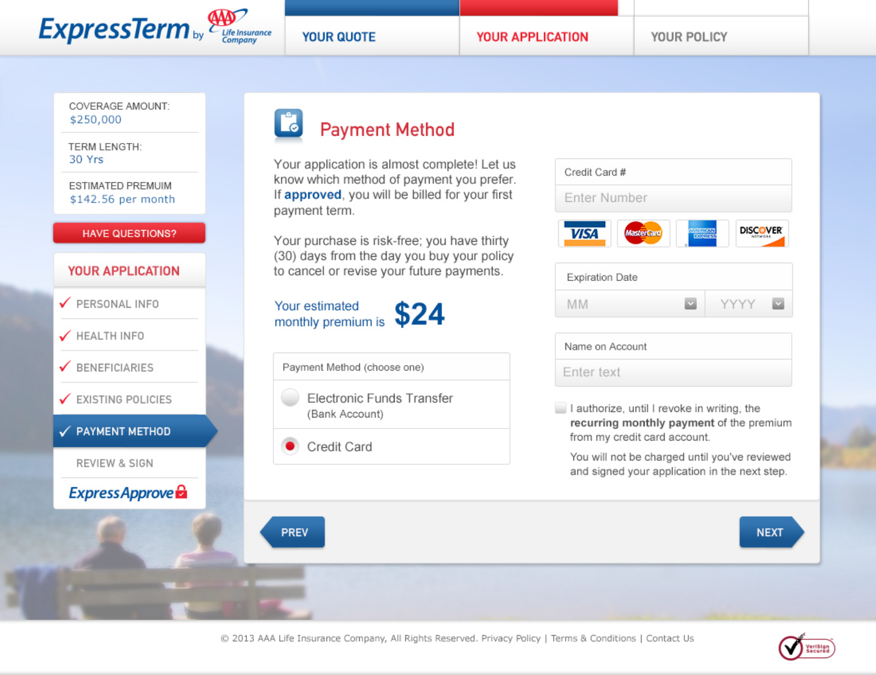
We noticed that even small confusions could break trust. People wanted to know how their health information would be used. Terms about beneficiaries and percentages caused questions. At payment, some people were unsure if clicking ahead would charge their card or just move them to a review.
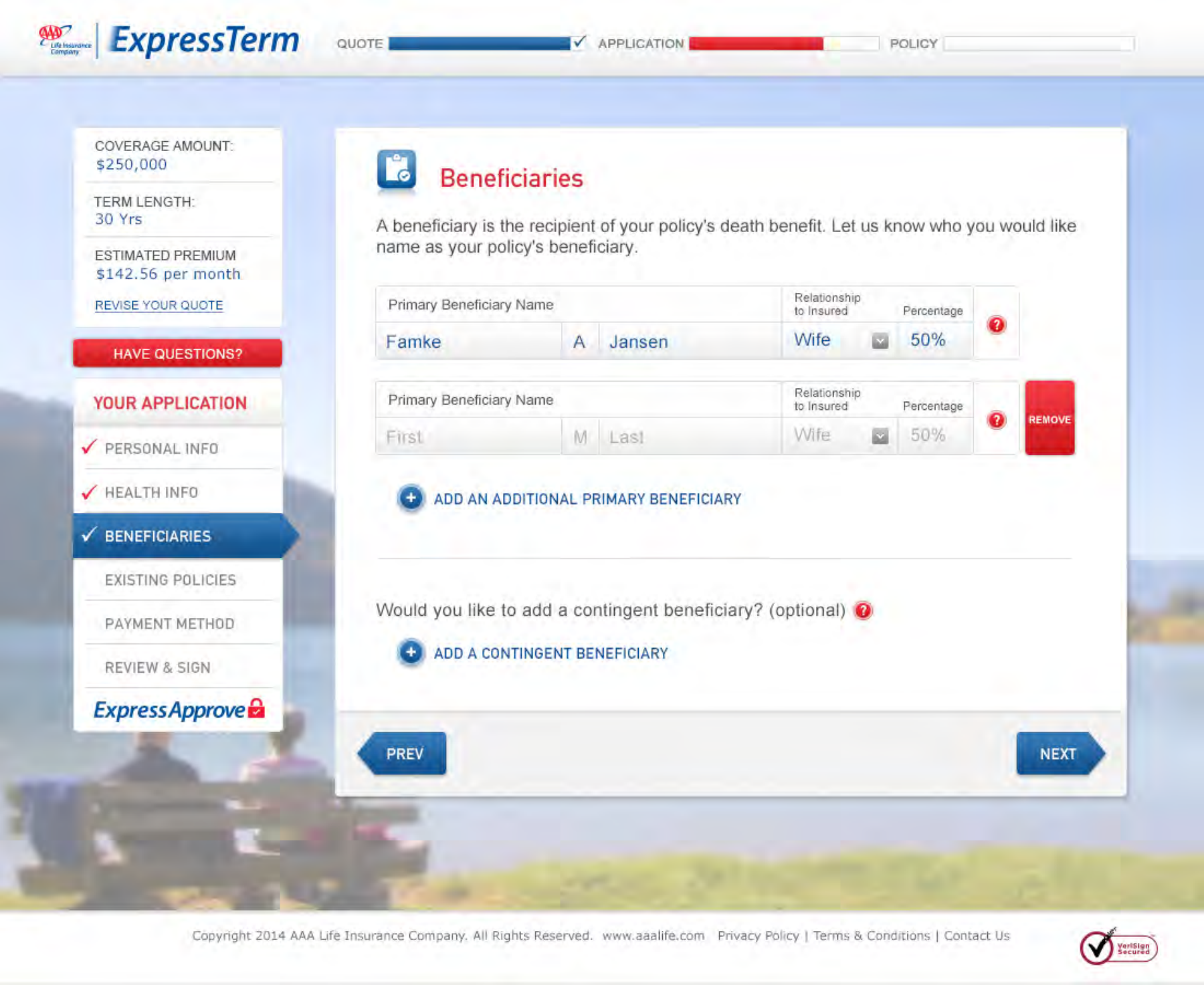
These insights gave us a clear to-do list: explain primary and contingent beneficiaries in plain language, put add and remove controls where people expect them, and clarify what happens between payment and review. We also needed to explain any premium changes and what steps to take next. Each recommendation reduced uncertainty and made the next step clear.
Every detail, even a button label, is as important as a campaign statement. It tells people what they are agreeing to and what will happen next.
A sensitive part of the application
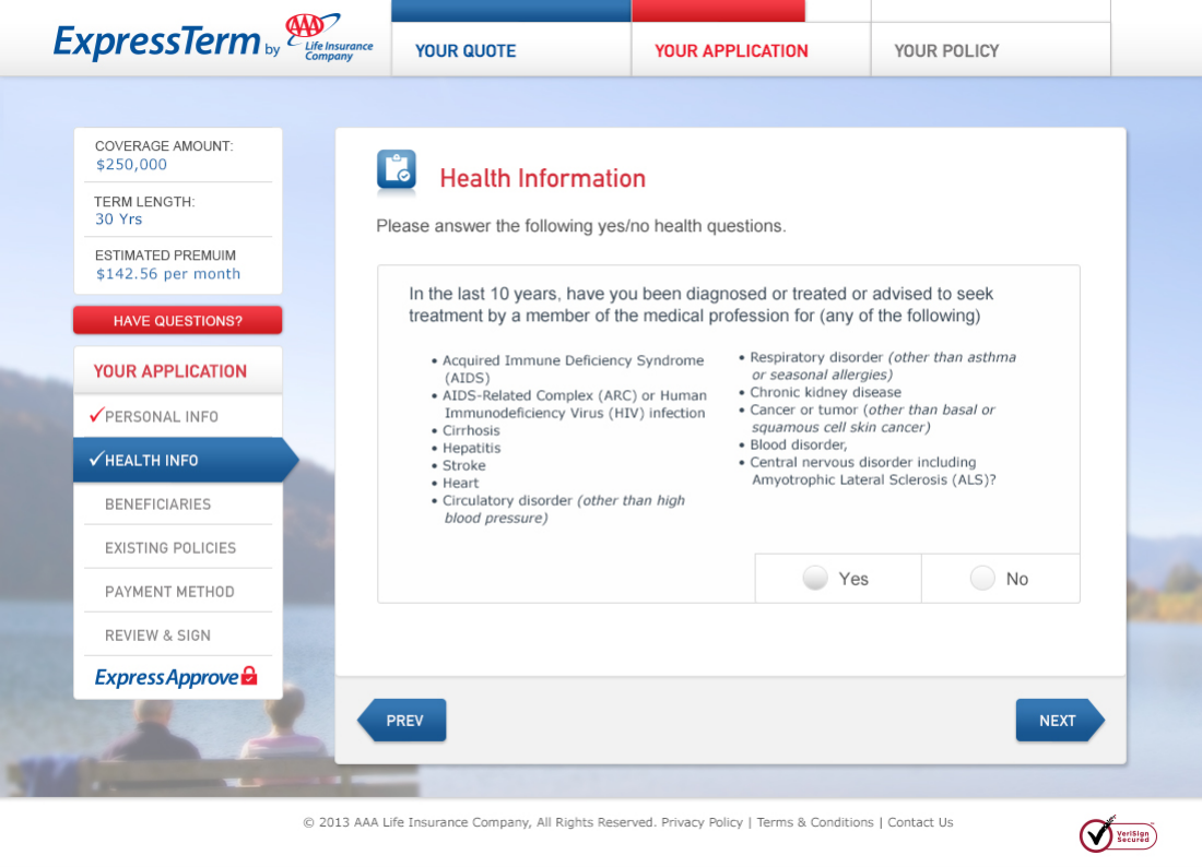
The right level of detail
Choosing who to protect
Reviewing the commitment
Carry the intent through implementation.
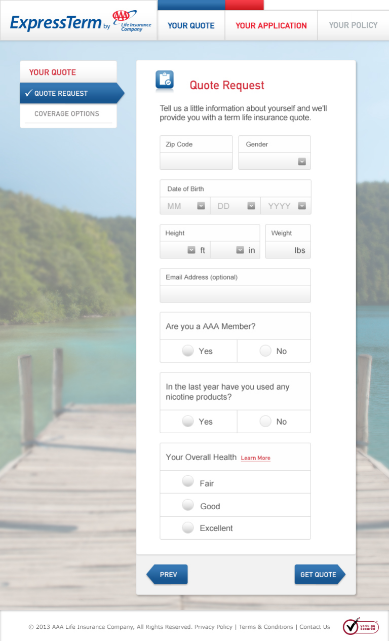
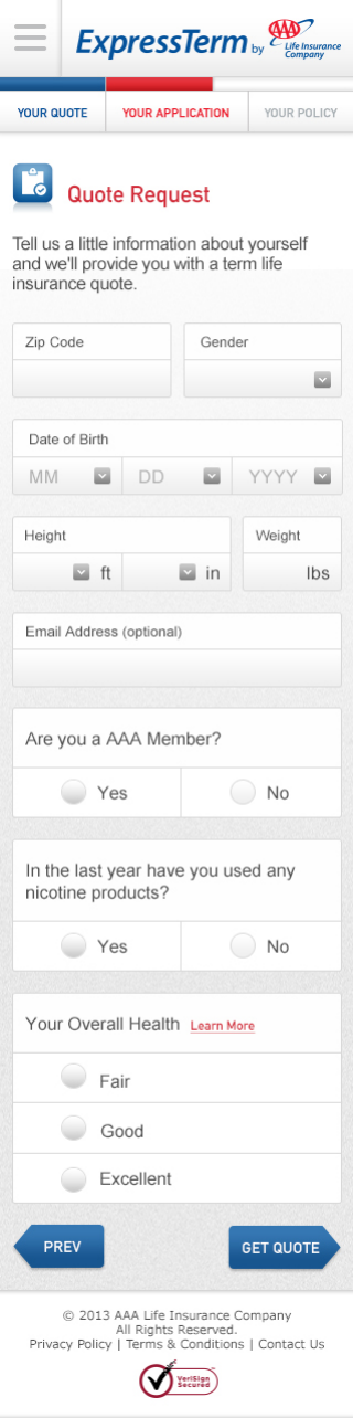
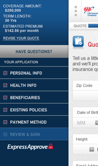
I stayed closely involved as design and development worked through challenges. The application questions needed to be flexible over time. Our wireframe review called for modular code so we could add, remove, or update questions as the product changed. AAA Life led the back-end implementation, and our team worked with their developers on the design handoff. By mapping user flows and building annotated screens, I helped AAA Life see both immediate solutions and future opportunities. Working closely with engineering, we solved technical problems, adjusted patterns, and kept communication open. I clarified how campaign and product templates would work together and made sure our adaptive approach worked for desktop, tablet, and mobile. The goal was to keep the design intent strong at every stage.
Tablet
Mobile
Navigation within reach
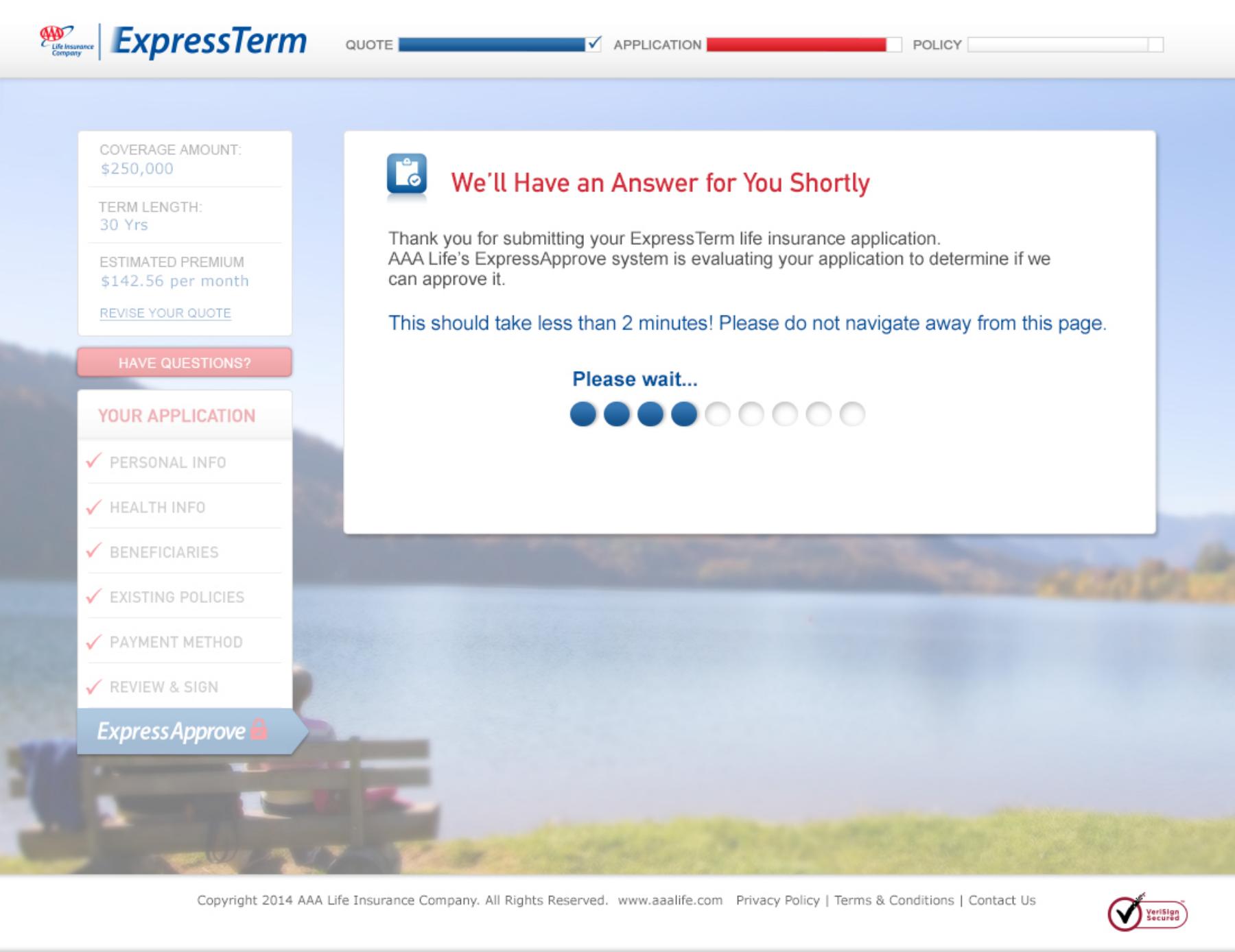
The processing screen had a simple job: to explain what happens after someone shares sensitive information. Testing showed people understood the wait. Our review clarified what should happen if underwriting services were unavailable, making the screen’s role even clearer.
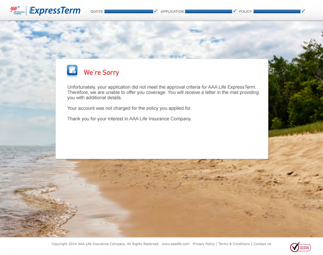
We built those alternate routes into the experience. When a decision could not be completed right away, the process used email to tell people how to return and continue. Approval, counteroffer, decline, and cancellation each needed a clear next step. The goal was to keep convenience and reassurance present, even when the process took a different path.
Make the wait understandable
Explain the outcome
Give the product a clear place in the brand.
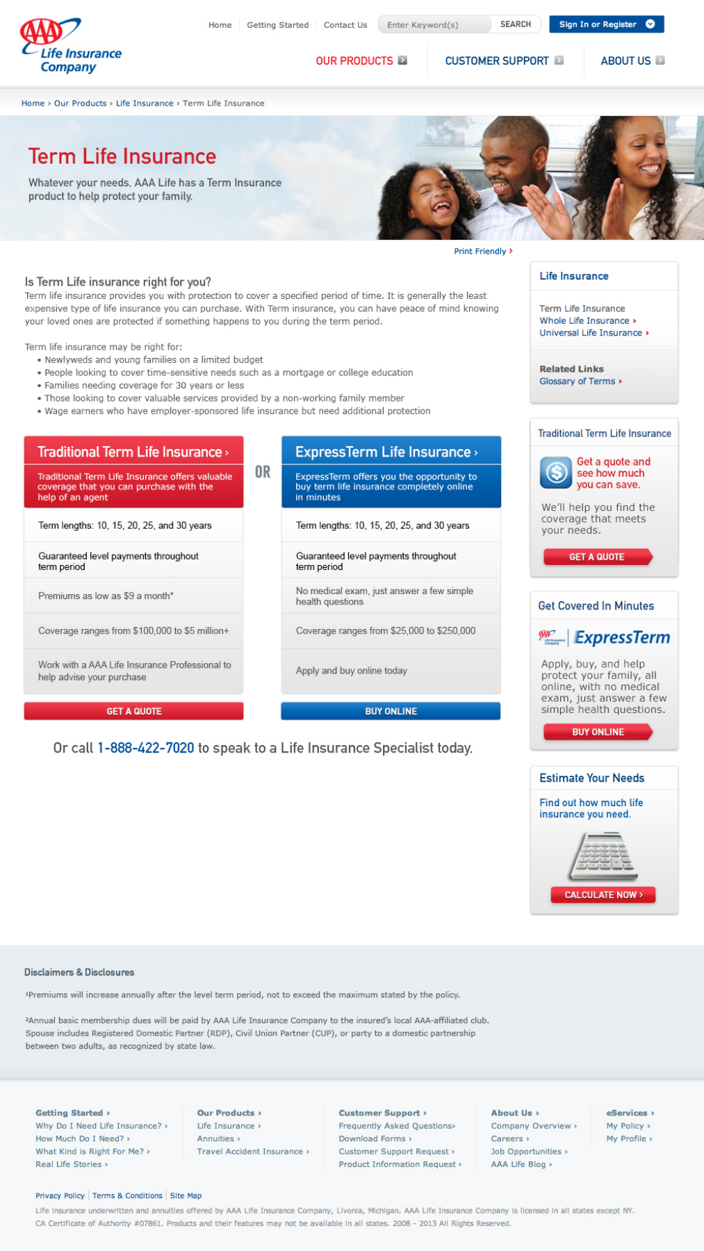
ExpressTerm needed a clear spot within AAA Life’s broader product lineup. We linked convenience, trust, and value to buying online. Product comparisons made it easy for people to see their options and decide whether to apply online or talk to an agent.
I helped shape the comparison content and the broader marketing copy. The experience strategy needed to appear in homepage promos, product pages, landing pages, and emails. Every touchpoint had to set clear expectations about what would happen next, what information was needed, and what support was available.
The product in context
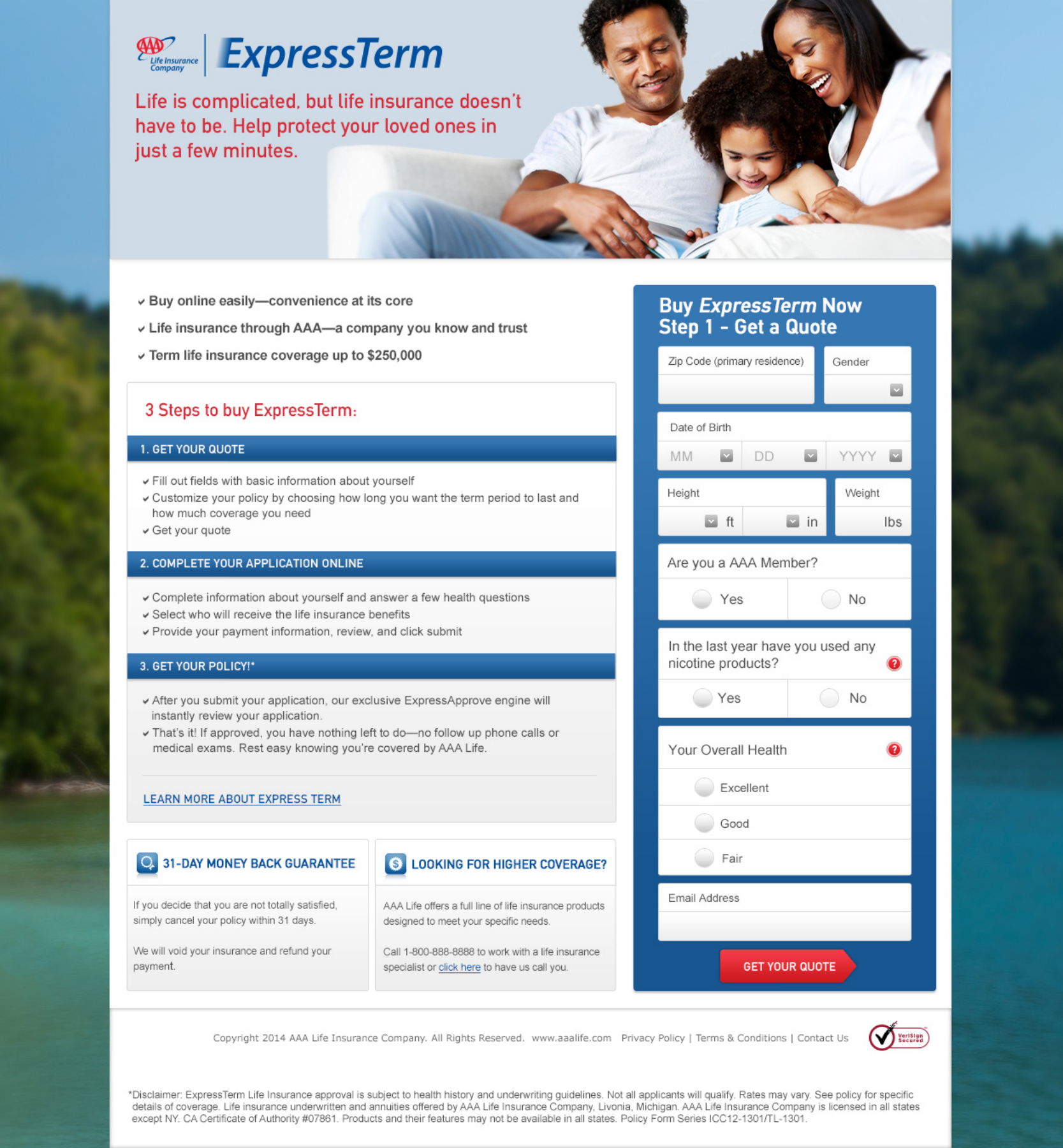
A clear invitation to begin
This project brought together strategy, design, content, and launch for ExpressTerm. I led and mentored a cross-functional team, giving people room to use their strengths and encouraging open collaboration. By sharing ownership and guiding the team through challenges, I kept the effort unified from start to finish.
Testing showed that people understood and valued the online journey. It gave us a clear roadmap for future improvements. Nearly all test participants said they would feel comfortable buying life insurance online, especially from AAA Life. Our team’s collaboration helped rebuild the client’s trust. Enlighten’s leadership noticed the difference, and AAA Life’s outgoing CMO recognized our impact across the organization. In the end, we gave ExpressTerm a guided online experience within the AAA Life brand, focused on convenience and reassurance.
For me, the value of this work is in connecting the big promise to the small, personal decision. We gave an online insurance product a clear place, a guided experience, and a more human way to help people take the next step. This outcome matters because it shows how convenience and reassurance can bring the product’s promise to life when someone decides to move forward.
Role and collaboration
- JT Anderson
- VP and Executive Creative Director · Enlighten. Product positioning, executive creative direction, and experience direction.
- Enlighten team
- UX, visual design, content, and development collaboration.
- AAA Life partners
- Client and product leadership, back-end implementation, and design handoff.