Novant Health Now
A helpful voice. A clearer path to care.
Experience strategy, conversational AI, and visual design
When people look for care, they usually start with personal questions like: Who can help me? Which appointment is right for me? What should I do next? For Novant Health, my goal was to connect these questions to a digital experience that helps people find answers, the right provider, and a simpler way to get care.
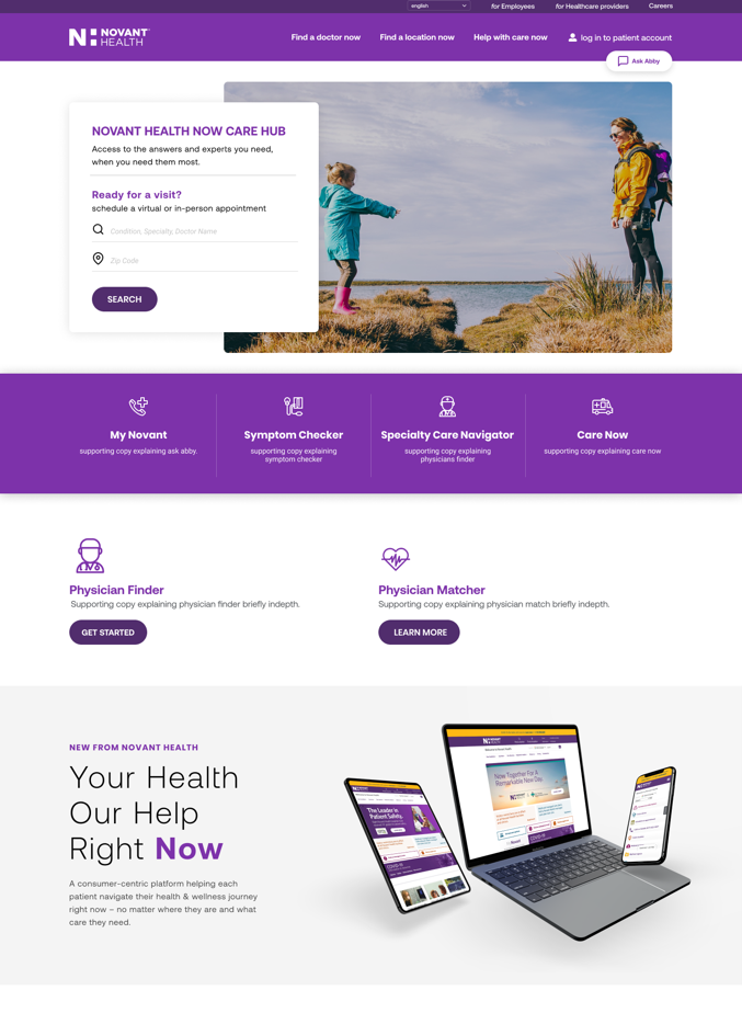
Care Hub concept · first visit
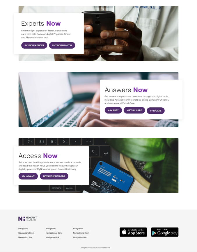
Care Hub concept · services
As an Experience Strategist at Perficient, I led the UX and design team for Novant Health Now and the full website redesign. I worked closely with strategy and content partners to keep everyone informed and make sure progress was clear for both our team and the client. In that role, my main goals were to create a helpful conversational experience with Ask Abby and to bring that same clarity and friendliness into patient flows, interface ideas, and visual design.
I wanted every detail of the experience to feel attentive. The way a virtual assistant asks questions, how easy it is to find a care tool, and even the mood of a photo all help people feel more confident about their next steps.
Ask Abby: strategy and conversational UX
Give the patient journey a clear direction
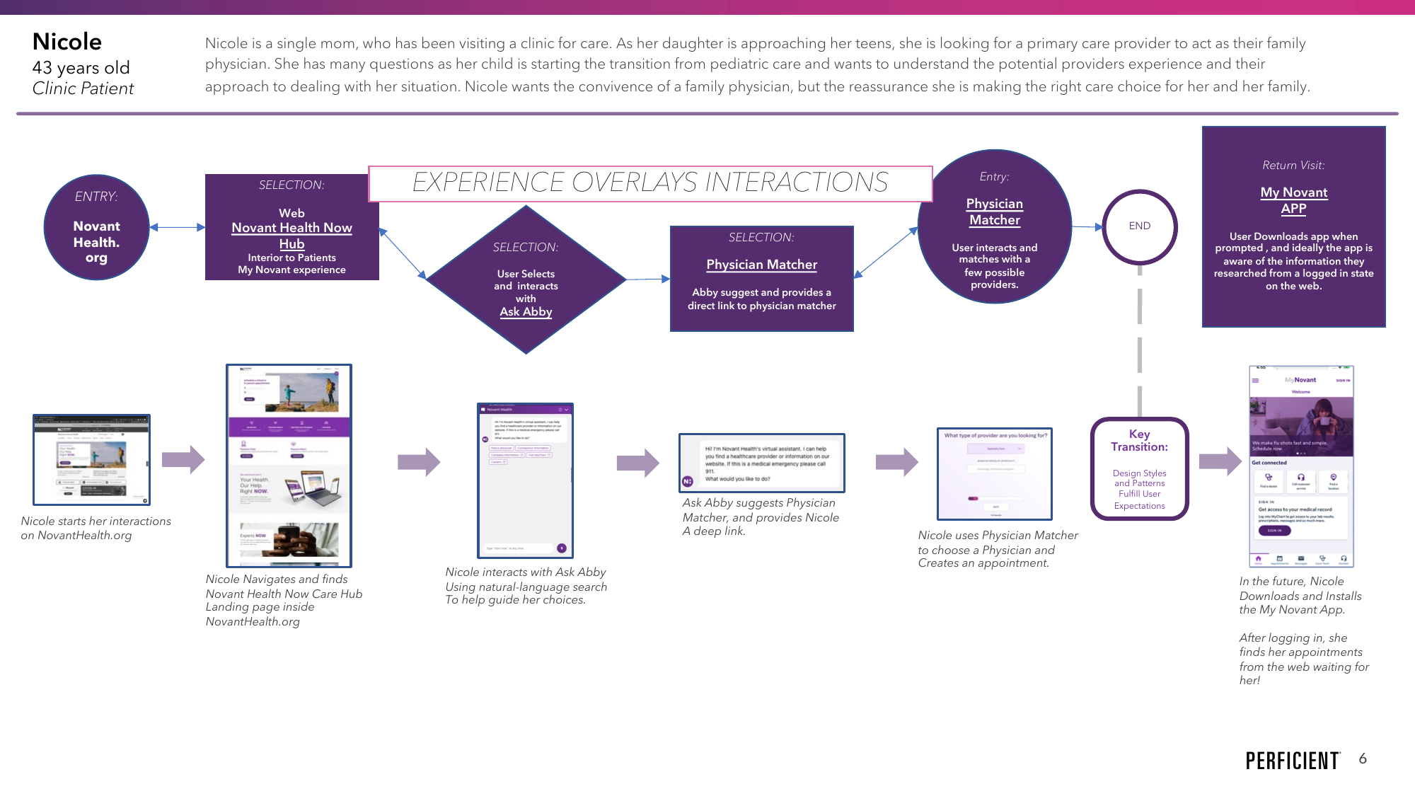
The initial project brief identified multiple patient entry points: parents managing household care, caregivers seeking answers, and digitally confident consumers wanting convenient access. Novant Health Now aimed to unify existing and emerging tools under a shared value proposition, so our team needed to clarify each tool's value while ensuring seamless transitions between them.
I moved client discussions from abstract mood boards to practical concept boards based on patient flows. This helped us focus on both appearance and how a person's question moved through digital tools, what information mattered at each step, and how to improve the journey. From there, we turned this process into clear deliverables like concept flows, style tiles, and selected template designs.
For example, one scenario mapped a mother searching for a family physician for her adolescent daughter. In the concept, Ask Abby would direct her to Physician Matcher, with a proposed connection to appointment scheduling in MyNovant. Another journey began with an established patient exploring specialty care via the app. Together, these scenarios made handoffs between website, care tools, and the app visible, along with their integration needs.
Make the conversation useful
Our team's assessment of Ask Abby explored the current experience, persona, and conversation patterns. We uncovered a fundamental gap between how patients naturally request care and how the digital system interpreted their intent. For example, searching for a “heart doctor” might return physicians named Heart rather than cardiologists, and persistent search terms across tasks could derail relevant results.
These insights gave us clear problems to solve in the conversational AI strategy. We suggested improving intents, which are the goals behind each request, and entities, which are the details patients provide. The conversation needed to avoid confusion, keep useful context, explain unfamiliar terms, and let patients easily change earlier choices.
We developed a conversation framework covering prompts, clarifications, error recovery, next best action, and escalation to a human agent. In the proposed flow, an “I'm not sure” response would prompt a helpful follow-up question, a healthcare design choice intended to accommodate uncertainty while keeping the patient moving forward.
Existing interaction
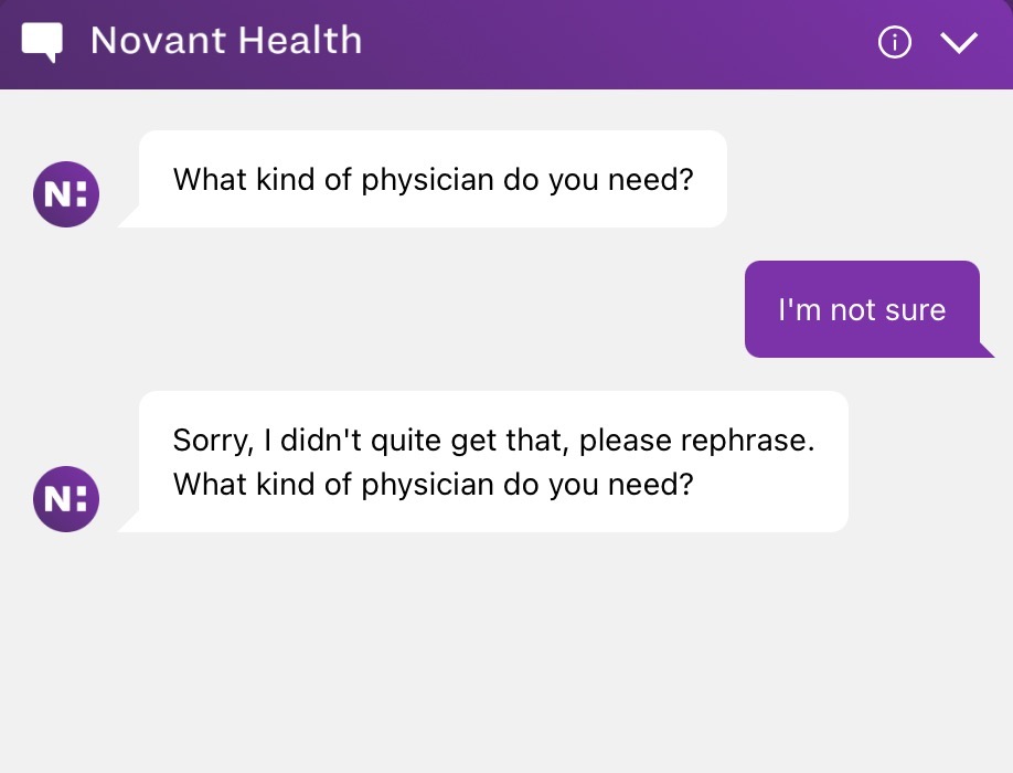
Proposed improvement
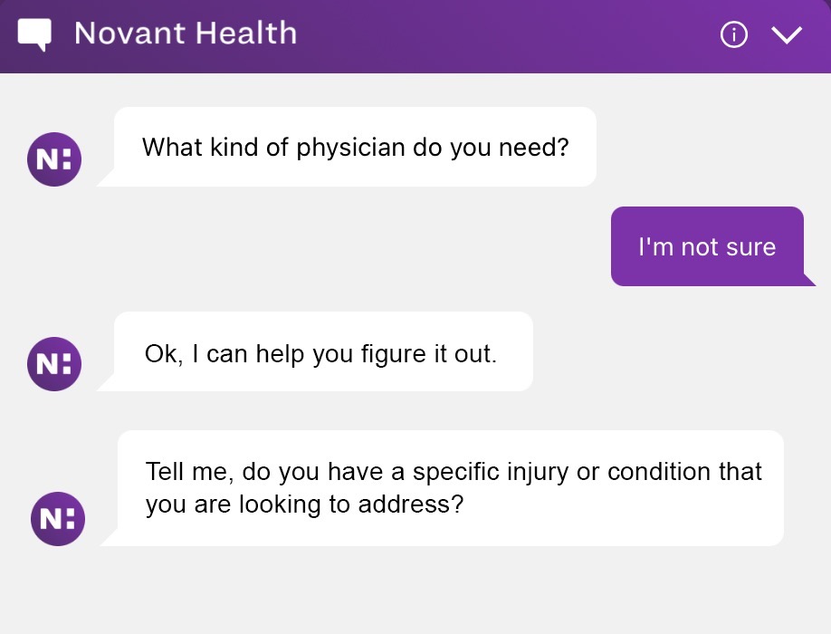
Explore the conversation framework
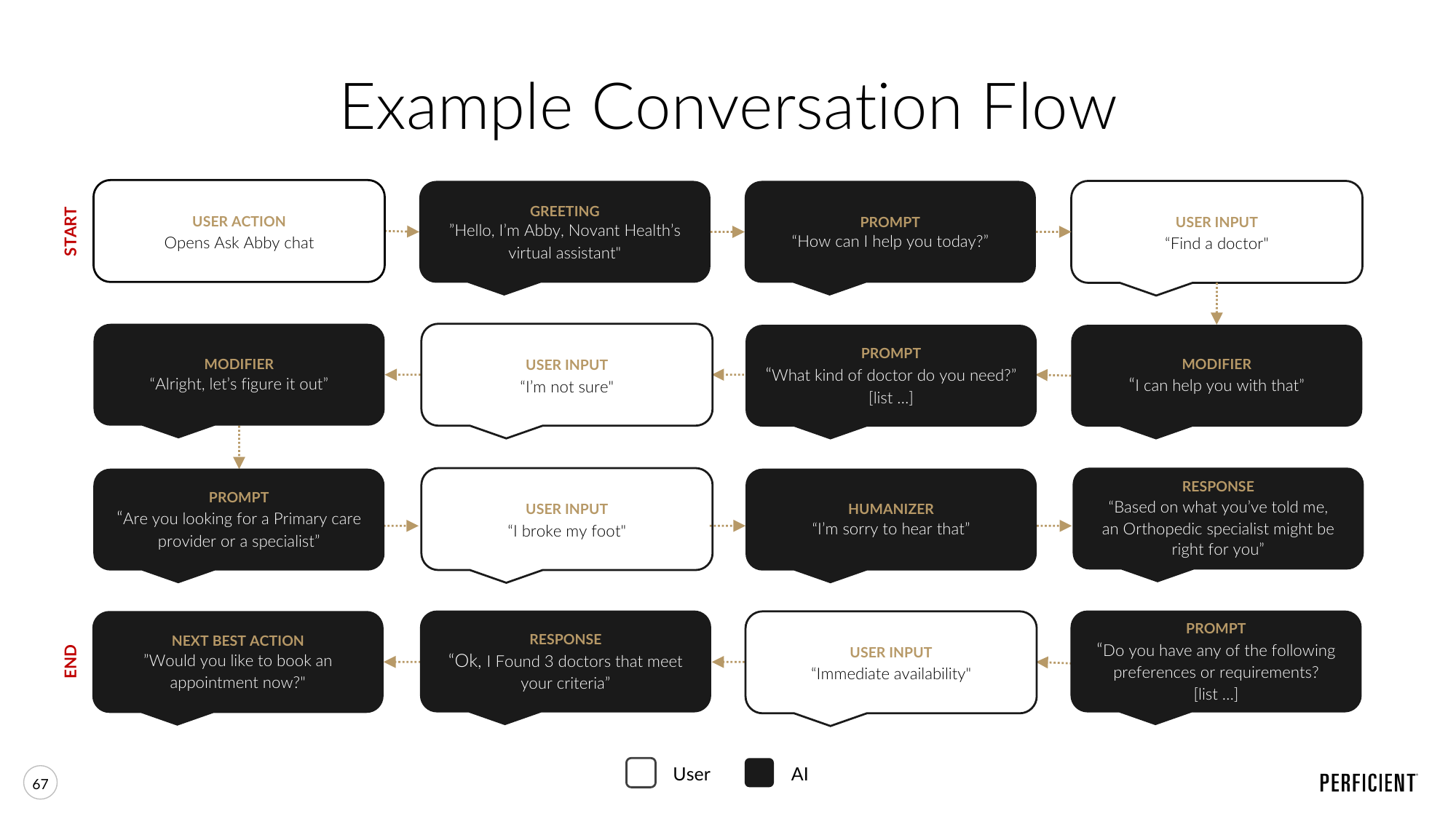
Give the voice a consistent character and a responsive tone
We defined Abby’s persona as approachable, empathetic, and knowledgeable, with practical language and a tone suited to each situation. The proposed guidance called for a casual tone during exploration, reassurance when someone was concerned, and clarity and precision when urgency came up.
Even small wording choices made a difference. For example, “What can I help you with?” offered direct help. “Where are you looking to find care?” focused on the person's care needs and location. We proposed contextual help and introductions at moments where guidance would be useful. Together, these choices defined how the service should interpret requests, handle uncertainty, and guide people to the right next step.
Our recommendations also included natural-language search and bringing chatbot skills onto a shared platform. My role was to connect that strategy to patient flows and the broader digital experience.
The same character. A response that fits the moment.
- Casual
Explore and exchange information in a relaxed manner.
- Concerned
Assist and reassure, building confidence in the information.
- Urgent
Use short, precise answers to make the next step clear.
View the original tone framework
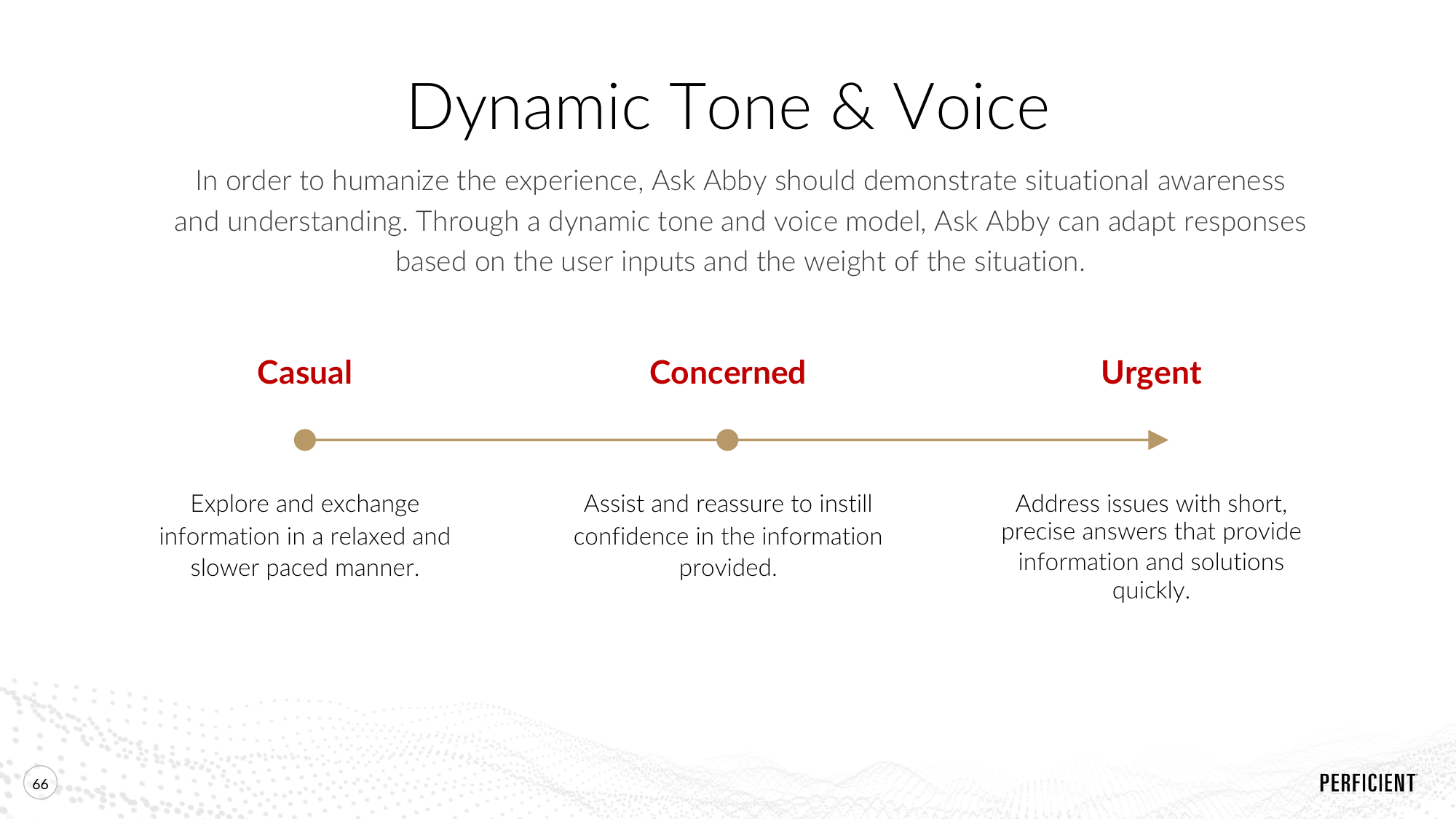
Language · tone · guidanceApproachable
TrustworthyVisual design
Imagery · hierarchy · actions
Carry the attitude into the design
Make warmth and expertise visible.
We brought that helpful attitude into the website and Care Hub by using clear priorities, friendly imagery, and visible next steps. Client discovery, brand guidance, and usability principles shaped a design direction focused on readability, hierarchy, photography, and familiar interaction patterns.
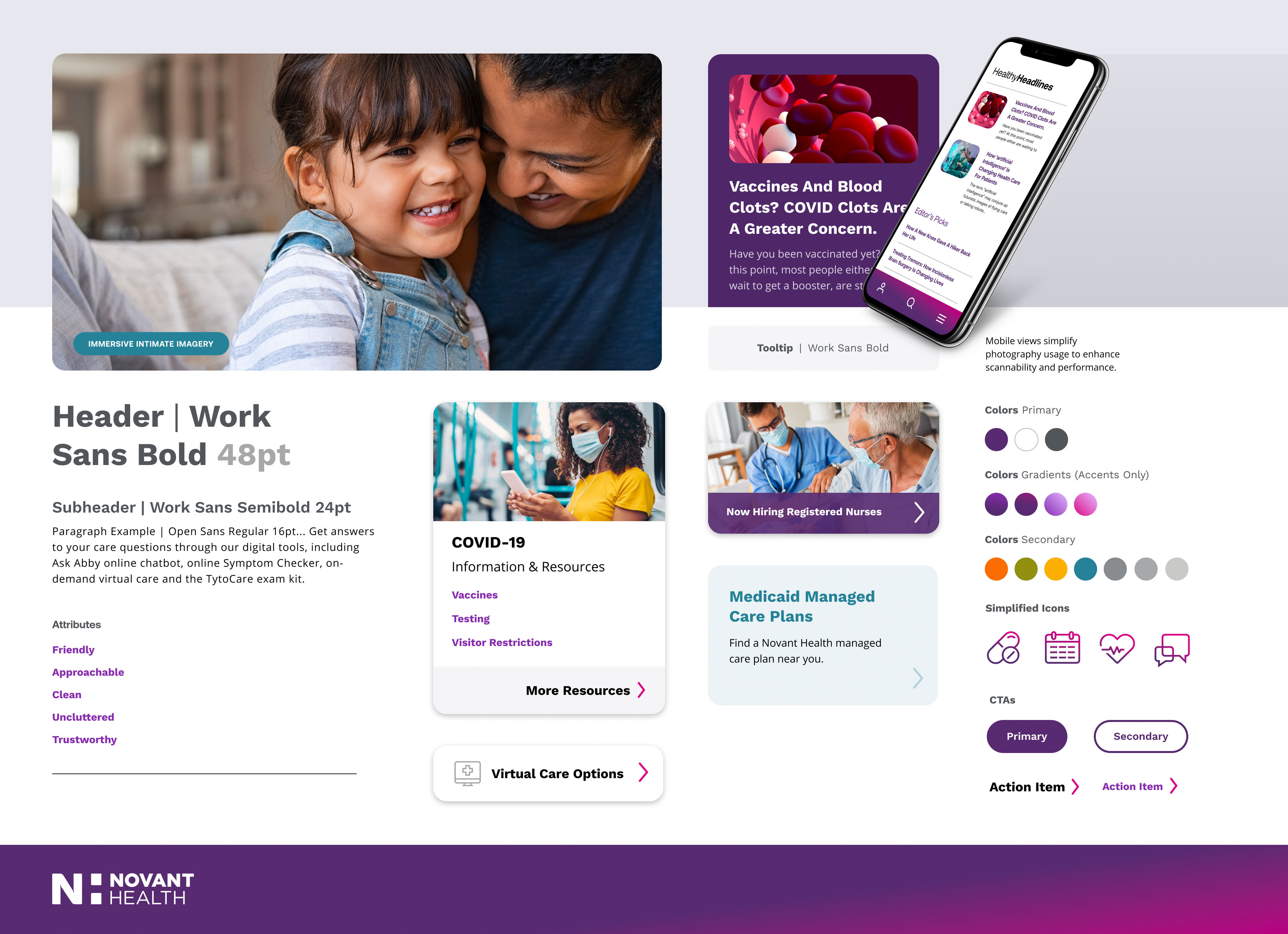
Style tiles gave the client a focused way to evaluate those choices before we developed selected templates. They showed how typography, buttons, cards, imagery, and color could work together across responsive pages.
Our recommended direction, OPEN, used close-up photography, generous space, bold headings, clear calls to action, and simple card backgrounds. The RICH alternative used stronger color blocks, deep purples, gradients, and more contained layouts. Showing both options made the trade-offs clear: visual emphasis, information density, and the balance between brand expression and reading comfort.
OPEN · recommended direction
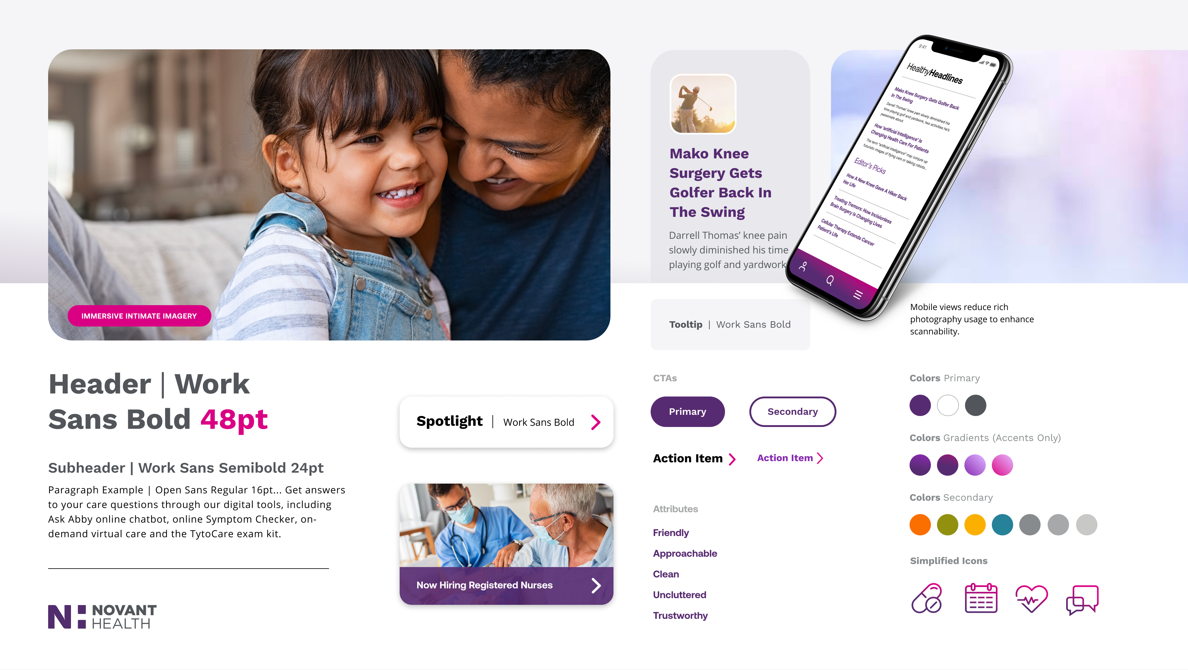
RICH · alternative direction
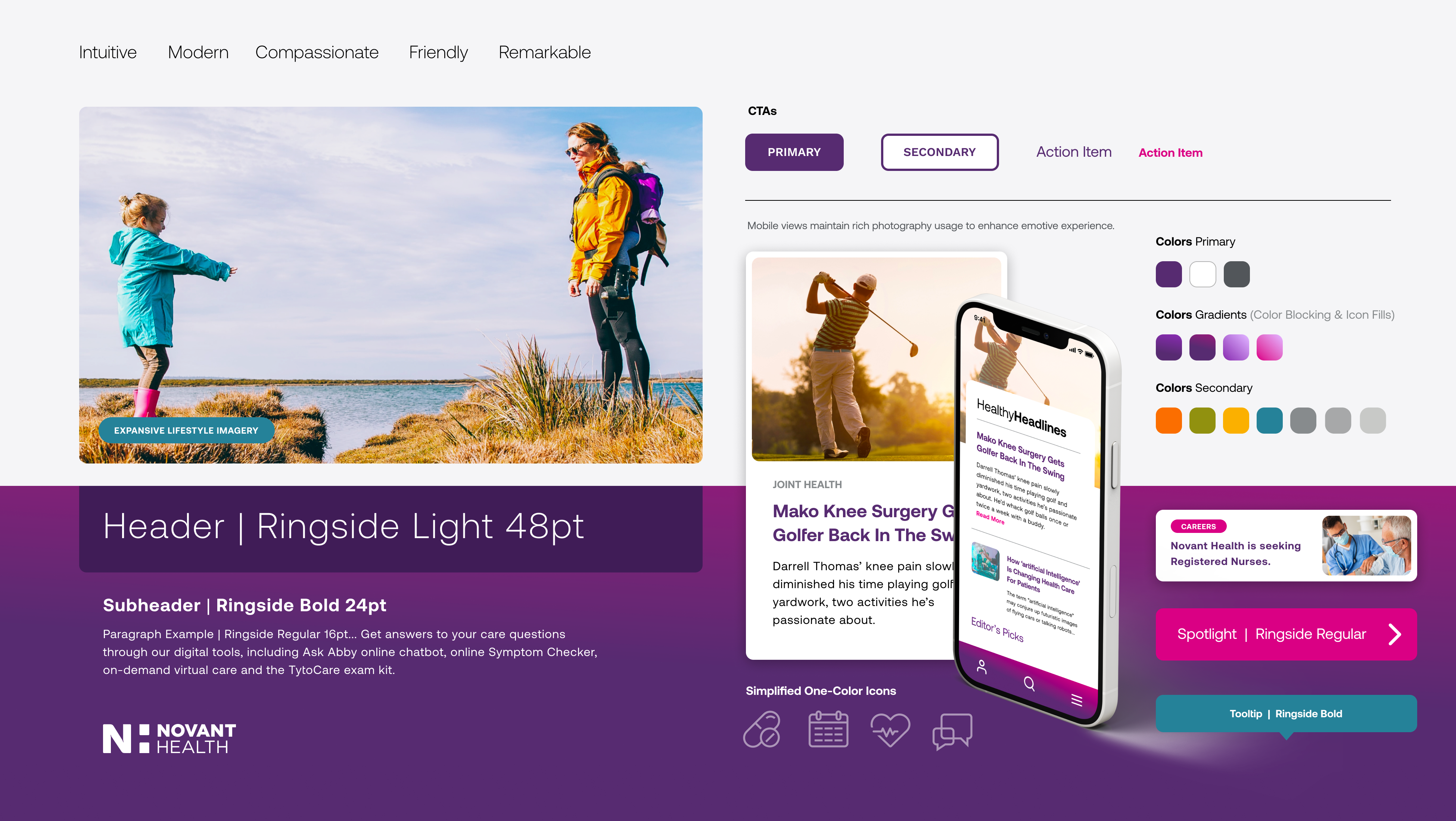
Client feedback helped us refine our direction. Novant wanted the design to feel warm and modern, but also show the expertise people expect from an academic medical center. That feedback created a clear design challenge: making the interface feel both welcoming and clinically credible.
We improved the OPEN direction with specific changes. The team reduced corner radius to balance friendliness with structure. Close-up photography added more human presence and color. Color-framed callouts and intentional gradients highlighted key moments, while main content areas stayed spacious. We recommended simple, single-color icons to keep the hierarchy clear.
We considered contrast across the entire composition. A page needs to work as a whole. Legibility, emphasis, and the space around information all affect how confidently someone can scan and act.
The refined direction
Turn the promise into useful interface choices.
We used that approach for Care Hub concepts for different patient needs. An anonymous visitor needed orientation and a clear invitation to find care. A signed-in patient needed appointment details and familiar account tools. Together, the concepts put those needs first while keeping a consistent visual style.
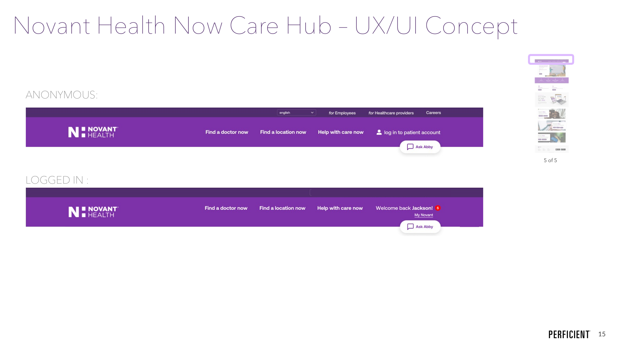
I helped shape the interface and promotional copy as part of the design. Headlines made the Hub’s purpose clear. Supporting language explained what each tool could do. Calls to action named the next step. Together, these choices turned the platform’s promise into something people could recognize and use.
Services had different technical capabilities. We recommended direct integration where possible, and consistent patterns, styles, and language across linked experiences, using the Aurora Design System as a guide. To keep that consistency as patients moved between services, we recommended sharing design decisions and discussing constraints across teams.
Give the team a usable basis for delivery
Discovery and design progressed together. During an important project presentation, Novant’s chief marketing officer asked for a creative brief specific to the project. This was a chance to align the team around a clear vision and next steps. With tight timelines and changing inputs, I clarified the decisions the brief needed to support, brought together strategy, brand, and discovery inputs, and flagged open questions about audience and content. I made staffing and timing choices clear and built the draft with colleagues, so stakeholders had a solid foundation to move forward.
The draft brief gave the team a document for reviewing the direction, open questions, and next steps with stakeholders.
A connected direction for digital care
The project produced patient-flow concepts, Care Hub designs and copy guidance, a conversational framework, and a visual direction refined with client input. These materials connected strategy to real decisions about language, navigation, imagery, and interaction, giving the team a clearer basis for building the experience and making the path to care more usable.
Novant announced the launch of Novant Health Now, built around Answers Now, Experts Now, and Access Now. The public rollout included the virtual assistant, Physician Matcher, and MyNovant connections.
Novant Health Now launch announcement
Throughout the project, I focused on keeping the patient’s next decision in view. A helpful digital personality only matters if it acts clearly. Visual direction is especially valuable when it makes choices easier to understand. Together, these elements gave the team a practical way to design a more approachable path to care and a clearer final step in the experience.